2022 was a year of significant product improvements and exciting developments for Mastt. Our team enhanced various aspects of the platform, and here are some highlights.
One of the most exciting milestones for Mastt in 2022 was that we reached 1000 users in Australia. We couldn’t have done it without the trust and support of our customers.
Cost Module
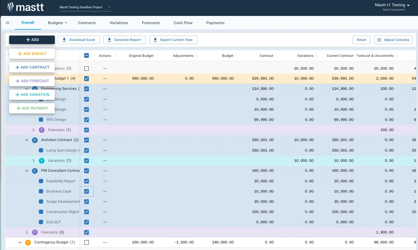
The most substantial changes happened on our Cost Overall page, where the team gave it a complete overhaul, with a focus on readability, accessibility, and usability. We looked at design elements such as contrast, colour, icons, spacing, font weights, and sizes, resulting in a vastly improved overall look and feel of the page and its table entities.
The system was also massively improved in terms of speed and configurability. Now our users are able to re-arrange, re-size, show and hide columns to present the cost data the way they want.

In addition to the Cost Overall page, we also made significant improvements to our cost module as a whole. We streamlined our contract form and forecast form, and we closed the loop on more cost reports. Our payment schedule is also automated to make it even easier for our users to keep track of their expenses.
Risk & Reporting
Another area of the platform that received a major upgrade was our Schedule page. We completely revamped it, making it more user-friendly and easier to navigate.

What's Next for us
As we look ahead to 2023, we will continue to deliver our mission, enabling our customers to deliver built environments efficiently and sustainably through easy-to-use digital tools. There are two big and exciting projects currently underway that will be getting released throughout Q1 2023: customisable dashboards & dashboard reports and an overhaul of the Cashflow page.
The first things to be released is an alpha version of our new Dashboard. The goal is to improve the usability and performance of our dashboards and the reports you can generate from them. The first alpha version we are working on will allow users to customise how the dashboard looks by adding or removing different tiles (don’t need to include them all if you don’t need to report on certain aspects), then being able to position and resize them through a drag and drop interface which can then be exported to PDF, perfectly matching up varied reporting requirements from our customers.
In a very similar style to the Overall page we are going to rebuild our Cashflow page within the Cost Module. The main focus of the overhaul is to improve readability, usability and reduce the time it takes to enter Cashflow forecast data. Stage One of this overhaul is to rebuild the chart and table in the same style as the Overall page, we will also be adding extra functionality around what range and level of detail is shown (i.e show all years by month or by year). Once Stage One is done, we are moving on to improve the data entry process for the page, with a focus on reducing the time to enter the changes in the cashflow forecasts month to month.
We hope that you're also excited like us right now with all the changes we're making for the system. This is only the start of the year when our big focus is coming closer to our vision of becoming the digital infrastructure that’s empowering the largest wave of urban growth in history.


.avif)


