Construction project management is no walk in the park. There's much to watch between shifting schedules, cost blowouts, and quality control issues.
That’s where a control chart comes in. This visual, data-driven tool helps project teams monitor key performance indicators over time—and more importantly—spot trouble before it gets out of hand.
In this post, we’ll walk you through what control charts are, how they’re used in project management (especially construction), what gets plotted, and real-world examples of their application. By the end, you’ll understand how to read one and want to build one.
What is a Control Chart (and Why It Matters)?
A control chart is a statistical tool used in quality control to monitor and control processes. As a core method in project management charts, they provide a visual representation of process data over time, allowing for the detection of trends, patterns, and anomalies.
As an essential part of Statistical Process Control (SPC), control charts help determine if a process is in control or if any special causes of variation are present. Widely recognized in frameworks such as the control chart PMP methodology, they enable teams to see the process behavior and make informed decisions to maintain or improve quality.
If you want to level up your project controls, this guide from Mastt is a great place to start.
Key Parts of a Control Chart: Control Limits
Understanding the key components of a control chart is crucial for effectively monitoring and managing process variations. In the context of project charts, these components help visualize the underlying health of your workflows.
- Center Line (CL): The average or mean value of the data.
- Upper and Lower Control Limits (UCL/LCL): The thresholds for normal variation.
- Data Points: The values measured over time.
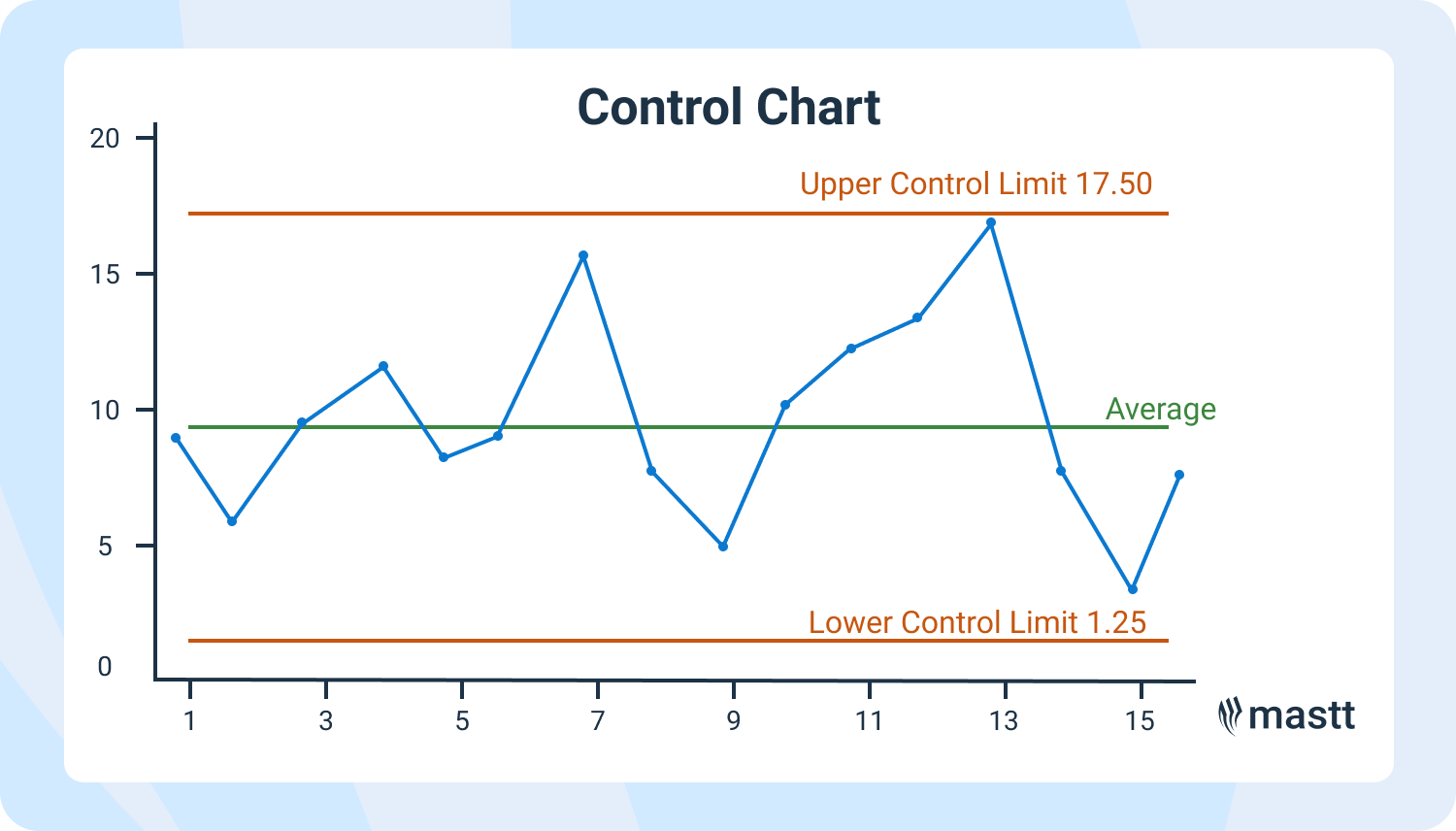
A control chart is to visually track key performance indicators, such as concrete cure strength or daily spend, allowing project teams to identify early signs of project drift. Ultimately, the purpose of a control chart is to determine whether a process remains stable or requires corrective action based on statistical signals.
What are Control Limits?
Control limits are the boundaries within which a process is considered to be in control. These limits are calculated based on the process data and are typically set at three standard deviations from the mean.
The upper control limit (UCL) and lower control limit (LCL) define the boundaries within which a process is considered stable. If a data point falls outside these limits, it signals a potential special cause of variation, prompting investigation to address any issues before they escalate.
The Purpose of Control Charts is to Keep You Ahead of the Curve
Control charts make it easy to identify patterns, trends, or red flags in a sea of data. They also help construction teams move from reactive firefighting to proactive decision-making, especially when managing a project schedule chart with complex dependencies.
These charts help determine if a process is in control by identifying if the observed variation is only common cause variation, which is inherent to the process, or if there are special causes that need attention by checking where data falls in relation to the upper and lower control limits.
Use control charts to:
- Detect when processes are trending out of control
- Analyze the cause-and-effect of project issues
- Drive continuous improvement without the guesswork
This proactive layer of monitoring helps project managers build more substantial cases for changes, delays, or cost increases, especially when dealing with stakeholders. It’s a core concept in monitoring and controlling in project management.
Types of Control Charts Used in Project Management
Most control charts focus on numeric data, which may not effectively handle more complex process data, such as non-Gaussian or mixed categorical data. They also help answer questions like "what is plotted on a control chart?", offering insights into variability and performance stability.
In control chart project management, different types of control charts suit different kinds of data. Here’s a breakdown of the most commonly used options in construction project management.
1. Variable Control Charts
These handle continuous data like time, cost, or strength. In a manufacturing process, these control charts are essential for monitoring and improving production efficiency by identifying variations and ensuring stable output.
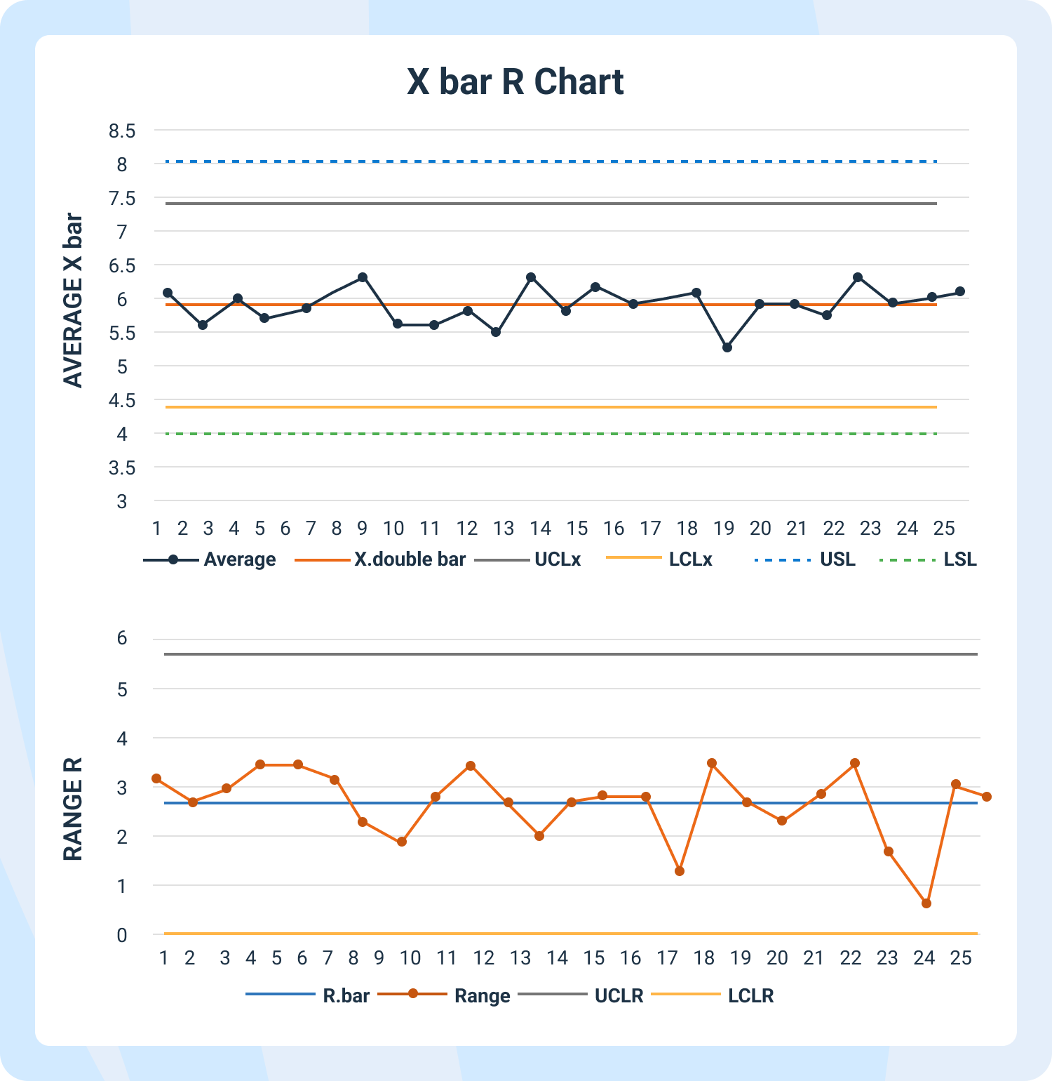
- X-bar and R Charts: Ideal for measuring averages and variation from small sample sizes. Example: Monitoring the slump test values across multiple concrete batches.
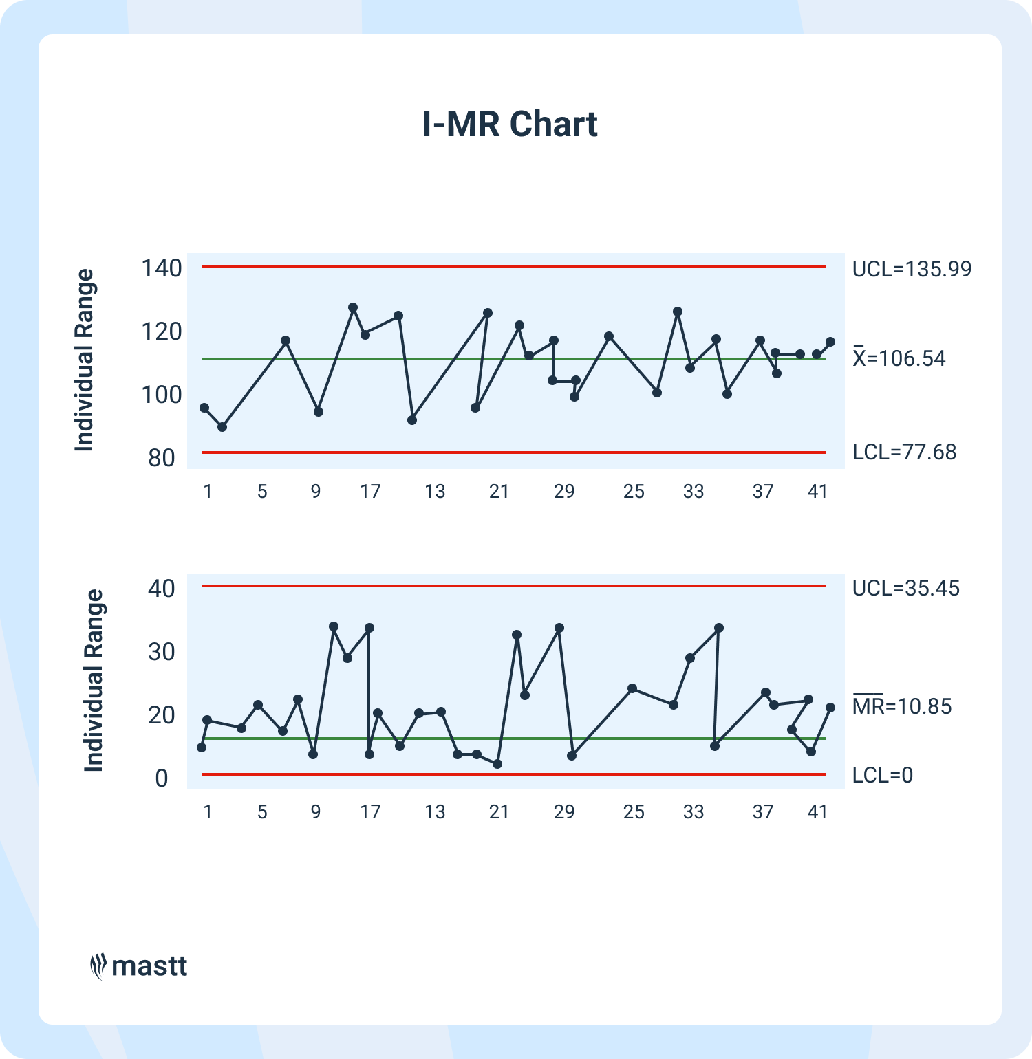
- Individuals and Moving Range (I-MR) Charts: Used for single data points over time. Example: Daily project expenditure or steel tensile strength test results.
These control chart methods often feature heavily in cost risk analysis, especially when evaluating real-time financial fluctuations.
2. Attribute Control Charts
Used for categorical or count data, like defects or failures.
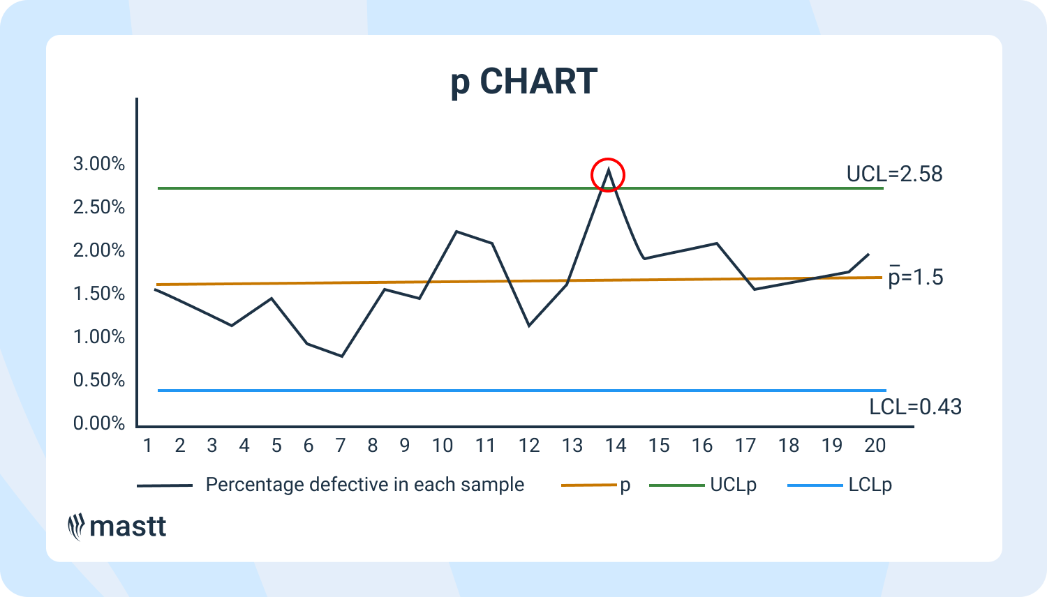
- P Charts: Show the percentage of defective units. Example: Percent of tasks failing initial QA inspections each week
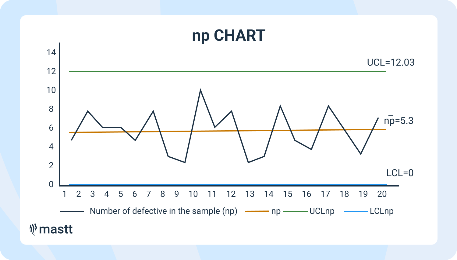
- NP Charts: Show the actual number of defects (with consistent sample sizes). Example: Number of defective prefabricated panels found each day.
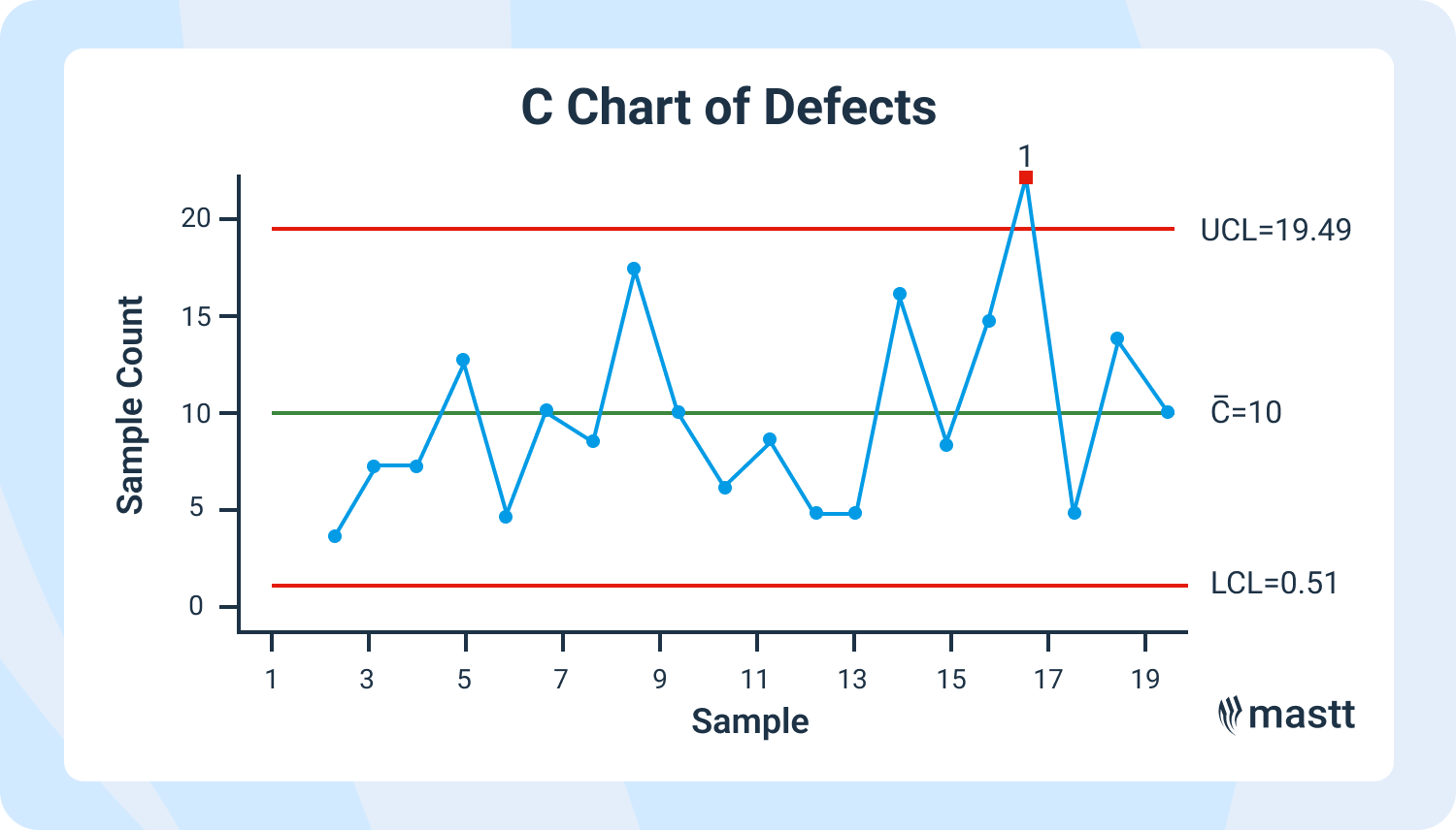
- C Charts: Count how many defects per unit. Example: Surface blemishes per installed door frame.
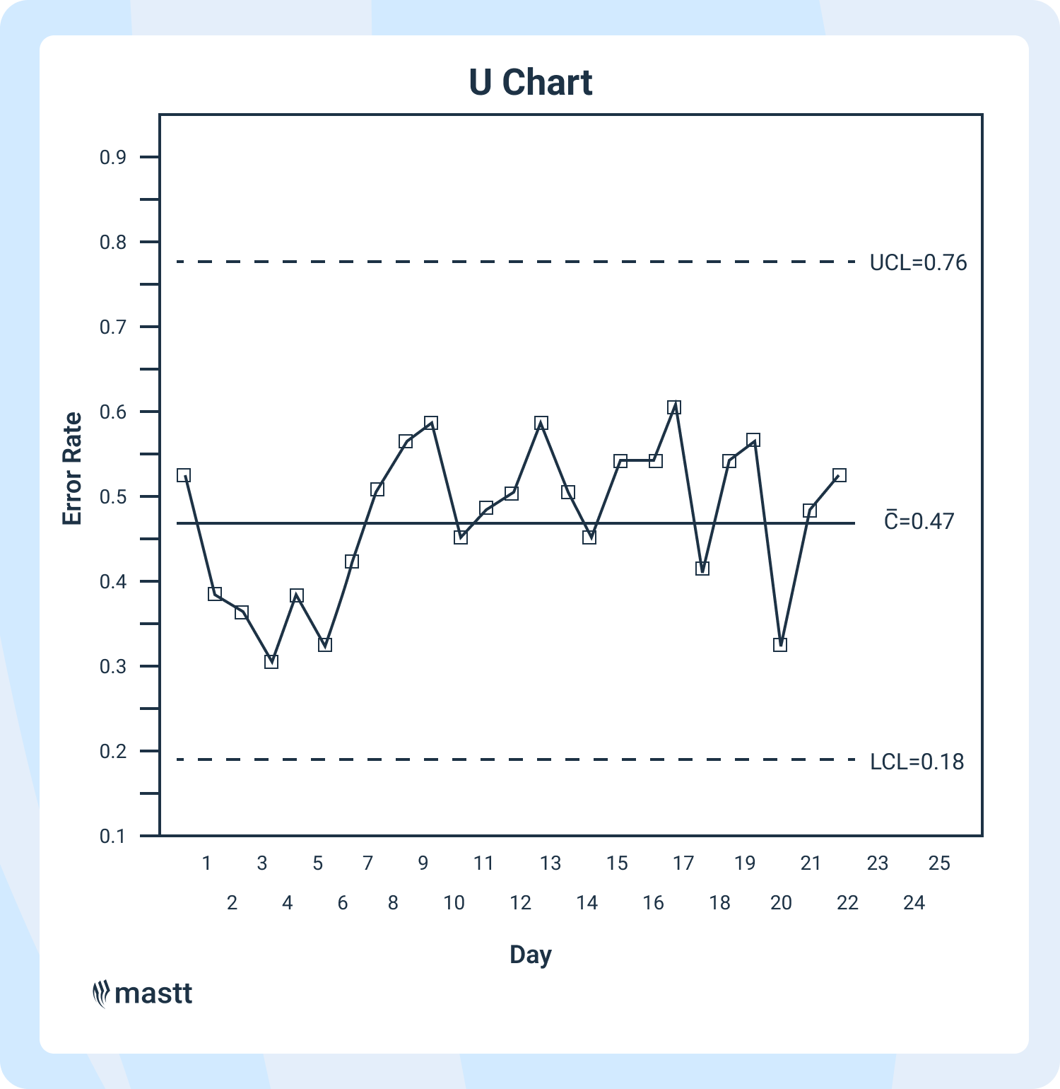
- U Charts: Like C charts, but for varying sample sizes. Example: Safety violations per hour of site inspections.
These examples demonstrate that project control techniques are versatile—you can apply them across multiple domains: quality, cost, time, and safety.
3. Run Charts vs Control Charts
Run charts and control charts are both valuable tools for monitoring process performance over time. However, if you're wondering what is a control chart in project management, it's important to know that control charts provide additional statistical information that run charts do not.
While run charts can illustrate trends and patterns, control charts go further by distinguishing between common cause and unique cause variation, which is key for identifying process instability. This structured approach makes control charts more powerful for assessing and improving process stability and quality.
What is Statistical Process Control (SPC)?
Statistical Process Control (SPC) is a quality control method that uses statistical techniques to monitor and control a process. SPC helps organizations maintain consistency in their operations by identifying and reducing variability.
Control charts are essential in Statistical Process Control (SPC) for monitoring process performance over time. They help ensure processes remain in control, leading to consistent quality across various industries.
Control Chart Examples in Construction Projects
Let’s look at practical examples of control charts in project management, especially construction.
For instance, if seven consecutive points fall on one side of the centerline, it signals a significant shift in the process, indicating a need for further investigation.
Project Timeline Chart: Monitoring Schedule Health
In construction management, X-bar and R charts are vital for monitoring schedule health by identifying potential delays.
- Use X-bar and R charts to monitor milestone delays. Track average delays for repeating activities like formwork cycles across projects.
- Use I-MR charts to monitor critical path float. This gives you an early warning before the project schedule control derails.
This also ties closely with integrated master schedule development and performance tracking across large-scale capital projects.
Cost Control: Tracking Budget Drift
Maintaining control over the budget is crucial in construction project management to ensure project success and prevent financial overruns.
- Use I-MR charts to flag cost overruns before they get baked into the final budget. Each day’s spend vs planned budget plotted and monitored.
- X-bar and R charts can monitor cost variance trends across contractors or sites. Useful in cost loaded schedule and budgeting contexts.
Control chart insights also support initiatives in program controls, where project clusters need central oversight.
Quality Control: Staying Ahead of Rework
In construction, maintaining quality is paramount to project success and client satisfaction.
- P charts help visualize if QA failures are increasing. Example: Proportion of rebar inspections failing tolerance checks.
- C charts are great for counting punch-list defects during handover inspections. A spike = time for a process audit.
By identifying whether the observed variation is only common cause variation or if there are special causes, teams can take appropriate actions to maintain quality.
Quality tracking often works best when paired with a performance measurement baseline to compare against contract tolerances.
Safety Monitoring: Keeping Sites Safe
Safety is paramount in construction, and monitoring it effectively ensures compliance and the well-being of all workers involved.
The table below highlights real-world case studies where control charts were applied to monitor performance and drive improvements across different types of construction projects:
How to Interpret a Control Chart Like a Pro
You’ve got the chart. Now what? Here’s what to watch for:
- A point outside control limits = special cause. Investigate where the points fall and determine the cause!
- 7 points trending in one direction = process shift.
- 8+ points on one side of the center line = non-random variation.
Interpretation depends on context. A spike in defects? It might be poor training. A dip in safety incidents? It could be a new toolbox talk paying off. Don’t just react—connect the dots. This is where forecast project management methods shine.
It also helps when the team understands the difference between project controls vs project management, so roles are aligned during process changes.
Best Practices for Using Control Charts
To get the most out of control charts, it’s essential to follow best practices. Here are some tips:
- Use control charts to monitor process performance over time.
- Set control limits based on process data and adjust them as necessary.
- Use control charts to detect process data trends, patterns, and anomalies.
- Investigate out-of-control points to determine the cause of variation.
- Use control charts to identify areas for improvement and predict future results.
- Continuously monitor and update control charts to ensure process stability.
By following these best practices, organizations can use control charts to improve process performance, reduce variability, and increase quality. Control charts provide a structured approach to monitoring processes, enabling teams to make data-driven decisions and drive continuous improvement.
Tools of the Trade: Control Charts in Excel (and Beyond)
Want to try this yourself? You don’t need fancy software. Control charts in Excel are very doable:
- Use built-in chart tools and formulas
- Add average lines and control limits manually
- Automate with Excel templates or add-ins
Tools like integrated project controls can scale charting and integrate with your planning workflows for larger or multi-project portfolios.
You can overlay trends on a resource histogram or validate process control using change control management tools.
Bringing Control Charts into Your Workflow
Ready to get started? Here’s a quick step-by-step:
- Identify the process or metric to track (schedule, cost, quality, etc.)
- Choose the correct type of control chart.
- Collect baseline data (20–25 points is ideal).
- Calculate the center line and control limits.
- Plot your data regularly.
- Watch for signals. Investigate. Improve. Repeat.
Control charts don’t have to be overwhelming. Start simple—then scale with confidence. Whether you’re working with project control services, setting a project baseline, or improving your s-curve analysis, the methodology remains effective.
Wrapping Up: Why Control Charts Belong in Every Construction Toolbox
Control charts are essential tools for early warning, aiding decision-making, and catalyzing process improvement. They provide the necessary visibility to confidently manage budgets, meet milestones, reduce rework, and enhance safety in construction projects.
By embedding them into your everyday project workflows, you create a proactive culture where data drives decisions and surprises are minimized. In a high-stakes industry like construction, that clarity can make the difference between delivering a successful project and managing another fire drill.


![Controls Chart in Project Management [Examples]](https://cdn.prod.website-files.com/607f739c92f9cf647516b37b/67ed9bb5c66a6a9d585a90dc_controls-chart-in-project-management.webp)


